The Science On a Sphere (SOS) team released an update for the SOS Explorer™ (SOSx) mobile app, which lets anyone with a smartphone or tablet engage with NOAA Earth and space science data visualizations. The new release features support for Chromebooks and access to the app in Spanish and Chinese languages.
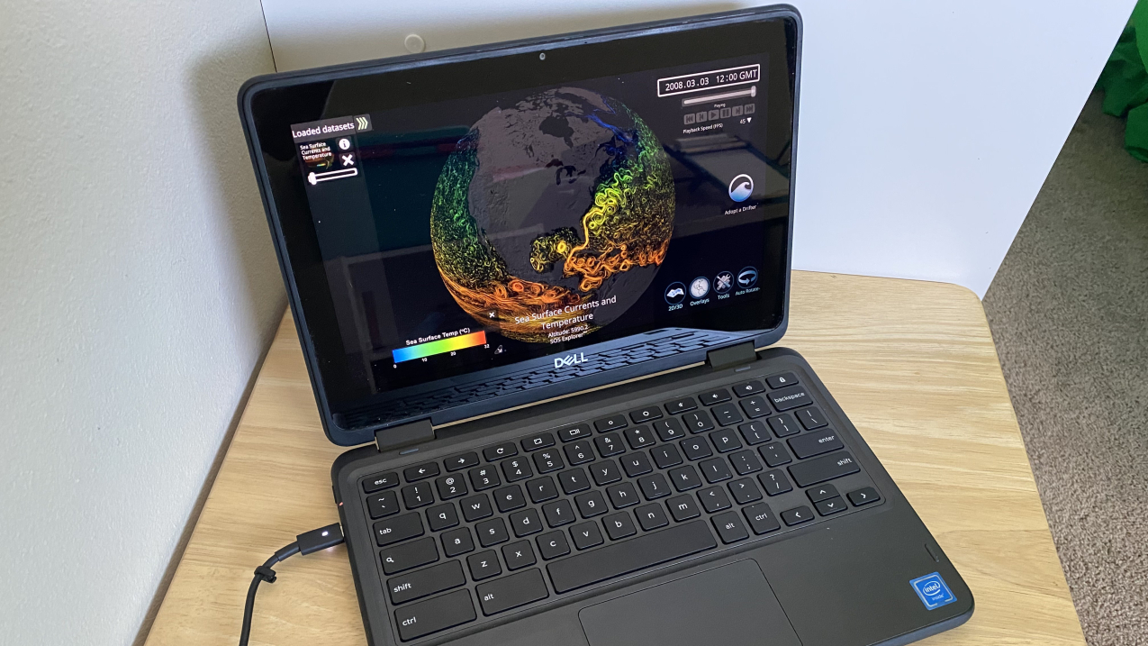
The NOAA Science on a Sphere Explorer free app can now be downloaded onto most Chromebooks as an Android app from the GooglePlay Store. (Image credit: Courtesy of Beth Russell/NOAA Science on a Sphere)
Originally released in 2019, the SOSx mobile app was designed by the NOAA Science On a Sphere team to provide engaging visualizations of Earth, ocean, atmosphere, land, and space data. You can download or update the app at the Google Play offsite link or Apple App Store offsite link.
New features bring SOSx into classrooms and beyond
The latest version of the app brings SOSx mobile to more users, just in time for summer programs and a new school year. The update fixes bugs that previously prevented it from working properly on Chromebooks and some newer Android devices. “After the pandemic, we heard from teachers that most students do their school work on Chromebooks, so we are excited to get this released and into students’ hands,” said Hilary Peddicord, the Education Specialist at Science On a Sphere, CIRES/CU Boulder.
Now, users have access in Spanish and Simplified and Classical Chinese languages, making the application accessible to more users worldwide. The app also includes a new auto-rotate feature that spins the globe, a toggle for displaying the legend, and a better representation of real-time satellite positions.
Staff picks: Explore our favorite SOSx datasets
Satellite Positions
A favorite from: Eric Hackathorn, Lead Developer for SOS Explorer
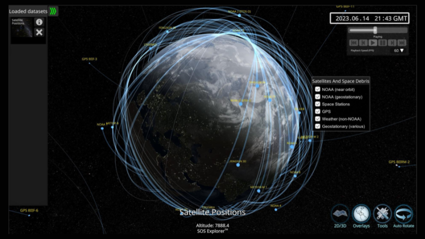
"I’m pretty partial to Satellite Positions, a near-real-time forecast view of many of the satellites scanning the globe right now. This dataset allows you to view paths and positions of dozens of satellites in current time and visualize where they will go in the next 16 hours. Tracking satellite positions in real-time and forecasting their future positions has numerous implications for astronomy, earth science, meteorology, and communication industries. The dataset sits at the intersection of physics, computer science, and geography." - Eric Hackathorn, Lead Developer for SOS Explorer
Earth in True Color (GOES East and West) - Real-time
A favorite from: Beth Russell, SOS Operations Manager
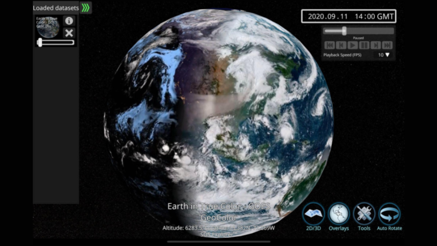
"This dataset provides an amazing view of what the NOAA geostationary satellites — NOAA East and NOAA West — are able to scan. The daytime imagery is a true color view of Earth, essentially what you would see if you were able to sit on the satellite and look back at Earth. The nighttime imagery displays an infrared view of the clouds, with blue representing low-level clouds and white representing higher level clouds associated with severe weather. This is a favorite dataset of mine because I like watching the progression from day to night and night to day and how the weather systems sweep across the United States. In this particular dataset, pulled from September 2020, you can also see the smoke from wildfires happening in California." - Beth Russell, SOS Operations Manager
Phytoplankton Model
A favorite from: Juan Pablo Hurtado Padilla, Visualization Lead for the Science on a Sphere program
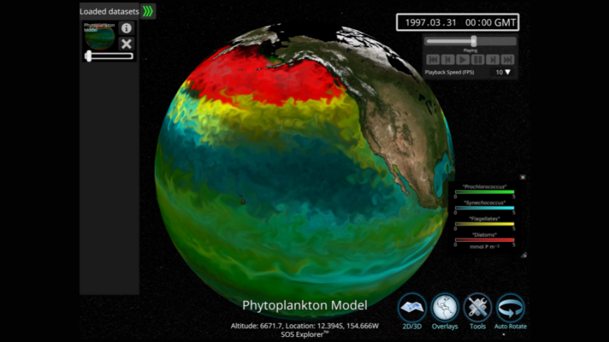
"Earth is a wonderful and incredibly complex system! Working on the Science on a Sphere program, I always get surprised by the interconnections in our planet. The phytoplankton model is a great example of that — it shows the seasonal variability of species that are part of the base of the food chain in the ocean. They change due to the seasons, and this change multiplies its effects as it moves up the food chain. This dataset always reminds me how everything on the planet is connected." - Juan Pablo Hurtado Padilla, Visualization Lead for the Science on a Sphere program
Biosphere: Marine Chlorophyll Concentration and Land Vegetation
A favorite from: Hilary Peddicord, Education Lead for Science on a Sphere and SOS Explorer
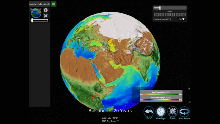
"I appreciate the Biosphere - 20 years dataset because it highlights the seasonal changes in the living system on Earth including both the vegetation on land as well as the chlorophyll concentration in the ocean. This dataset makes it possible to see real data of seasons in recent years — and you can even see that there are ‘deserts’ in the ocean!" - Hilary Peddicord, Education Lead for Science on a Sphere and SOS Explorer
Tsunami: Asteroid Impact - 66 Million Years Ago
A favorite from: Kayla Smith, NOAA Office of Education Communication and Outreach Specialist
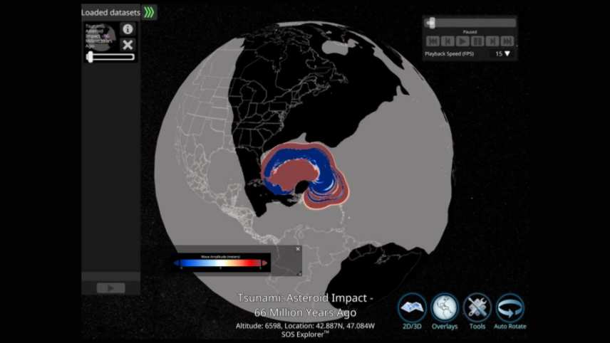
"Approximately 66 million years ago, Earth experienced the impact of an asteroid measuring over six miles in width. This cataclysmic event, which is generally considered responsible for the mass extinction of most dinosaurs and the loss of approximately three-quarters of Earth's plant and animal species, also generated a megatsunami with towering waves reaching a mile high. This is my favorite dataset animation and it was also incredibly popular with our curious social media audience with over 2.2M views! We got a lot of questions and it was wonderful to interact with and answer questions from people all around the world who were captivated by this animation." - Kayla Smith, NOAA Office of Education Communication and Outreach Specialist


